![]()
I find it admirable that Yahoo designed their new logo in-house over a weekend. A few staff tried different fonts using Adobe Illustrator. They knew that they wanted to stick with the word, exclamation point and colour, so all that would change was the font, letter sizing and spacing, and the possibility of extra imagery.
I like the final logo, but clearly most of the 3o contenders were terrible:
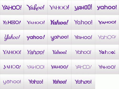
At least they didn’t spend millions outsourcing the task, as many companies did during boom times.
Meanwhile, Bing (Microsoft’s search engine) have changed their font and added a logo:
![]()
Read their blog post that goes into the whole creation process, and aspects of the logo that might not be obvious. I’m not sure if I like it or not, but I expect it to grow on me.
Lesson learned: if your logo is just your name in a nice font, it is easy to update in the future.